Designing Visually Impactful Business Presentations with PowerPoint
In today’s fast-paced business environment, PowerPoint presentations remain one of the most effective tools for communication—whether you’re pitching a strategy, presenting quarterly results, or onboarding new clients. However, many presentations fall flat due to poor design, cluttered slides, or inconsistent formatting. Creating visually impactful presentations is a skill that professionals across functions can benefit from mastering.
This blog post explores how to design visually appealing PowerPoint presentations tailored for business audiences, helping you engage stakeholders and convey messages with clarity and impact.
Why Presentation Design Matters in Business
Business presentations are not just about delivering information—they’re about persuasion, alignment, and decision-making. A well-designed slide deck:
- Enhances audience engagement
- Improves message retention
- Strengthens your credibility
- Supports clearer, faster decision-making
Design is not just aesthetics—it’s strategy. A visually consistent, concise presentation reinforces your brand and professionalism.
1. Start with a Clear Structure
Before opening PowerPoint, outline your presentation. A typical business presentation follows a logical flow:
- Title Slide: Clear topic and presenter details
- Agenda Slide: Preview of what’s to come
- Problem/Opportunity: What are you addressing?
- Analysis/Data: Supporting evidence
- Solution/Recommendation: Your key message
- Next Steps: Action items and ownership
- Q&A / Contact: Invite interaction
A well-structured presentation provides a roadmap that guides your audience from start to finish.
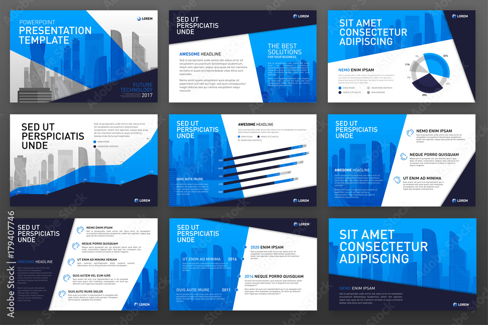
2. Choose a Clean, Professional Template
Stick with clean, minimalist templates that reflect your brand. Avoid overly decorative elements. Key tips:
- Use a consistent color palette (typically 2–3 complementary colors)
- Choose legible fonts (sans-serif like Calibri, Arial, or Roboto)
- Maintain uniform slide layouts (title, content, section breaks)
Avoid mixing multiple templates or using animations that distract rather than enhance.
3. Apply the 10-20-30 Rule (Modified for Business)
Guy Kawasaki’s 10-20-30 rule suggests: 10 slides, 20 minutes, 30-point font. While the slide count and time may vary in business, the core idea holds:
- Be concise
- Avoid text-heavy slides
- Use larger fonts to encourage brevity and clarity
This helps ensure that each slide delivers a single, powerful message.
4. Use Visuals Strategically
Visuals are not decorations—they are tools. Incorporate:
- Icons to represent ideas quickly
- Charts and graphs for data insights
- Infographics to simplify complex concepts
- Images to add context or emotion
Tip: Avoid overusing stock photos. If used, make sure they’re high quality and relevant to the topic.
5. Focus on One Idea Per Slide
Each slide should communicate one main idea. Use titles to summarize the key takeaway and content below to support it. Avoid:
- Overloading slides with multiple graphs
- Combining unrelated content
- Using full paragraphs of text
Bite-sized information is easier to process and remember.
6. Align Content Consistently
Design consistency reduces cognitive load. Apply the same formatting across slides:
- Same font sizes for headers and body text
- Aligned margins and bullet spacing
- Consistent use of bold/italic styles
Use PowerPoint’s “Align” tools and Master Slides feature to ensure consistency across your deck.
7. Highlight Data Effectively
Don’t just paste charts—tell a story with your data. Use callouts, color highlights, or trend arrows to draw attention to insights. Some quick tips:
- Use contrast to emphasize key numbers
- Choose the right chart type (e.g., line for trends, bar for comparisons)
- Avoid cluttered visuals—remove gridlines and extra labels
Use data storytelling to link numbers to decisions.
8. Maintain Brand Identity
Always incorporate your organization’s branding:
- Logo placement (usually in the corner)
- Brand-approved color schemes
- Slide footers with page numbers or disclaimers
This reinforces professionalism and helps presentations align with other company materials.
9. Rehearse with Your Visuals
Design complements delivery. Practice your presentation while reviewing the slides:
- Ensure transitions are smooth
- Time each section
- Check that visuals support what you’re saying—not compete with it
A well-rehearsed presenter appears confident and credible.
10. Use Tools and Resources Wisely
Modern tools can elevate your PowerPoint game:
- PowerPoint Designer: Offers layout suggestions
- Canva / Visme / Beautiful.ai: For polished visual design
- Noun Project: Free icons for professional slides
- Color.adobe.com: To create harmonious color palettes
These tools streamline design and ensure high-quality outputs without requiring graphic design expertise.
Real-World Example: Sales Pitch Deck
Imagine you’re presenting a sales proposal to a client:
- Slide 1: Clean title with client name and date
- Slide 2: Agenda with icons for each section
- Slide 3: Customer pain points summarized with visuals
- Slide 4: Data on industry trends via a clean bar chart
- Slide 5: Your tailored solution in 3 bullet points
- Slide 6: Pricing model with easy-to-read table
- Slide 7: Testimonials from past clients
- Slide 8: Next steps and timeline with icons
- Slide 9: Thank you + contact slide
The result: A crisp, modern, professional deck that builds trust and closes deals.
Conclusion
Creating visually appealing PowerPoint presentations for business doesn’t require a design degree—it requires clarity, structure, and a few best practices. Whether you’re in finance, marketing, HR, or operations, the ability to craft compelling presentations is a valuable professional skill.
Remember: Great design amplifies great content. By keeping your slides clean, consistent, and audience-focused, you can ensure that your business presentations are not just seen—but remembered.